
Best React Component Library for 2026: 11 Compared
How to pick a React component library in 2026: eleven compared by styling, code ownership, accessibility and licence, with a pick for each project.
A React component library gives you ready-made buttons, dialogs, tables, forms and page sections, so you spend your time on the product instead of rebuilding a date picker for the fifth time. The hard part is no longer finding one. It is choosing between a dozen good ones that work in very different ways.
This guide compares eleven React component libraries by the things that decide whether you will still be happy in a year: how they are styled, who owns the code, how much accessibility work is done for you, and what the licence allows. There is a short answer for each kind of project, then the detail. Versions, component counts and prices change often, so confirm anything that matters on each project's own site before you commit.
The short answer
- New app on Tailwind CSS, and you want to own the code: shadcn/ui.
- Large internal tool or dashboard with heavy tables and forms: MUI or Ant Design.
- A full kit with hooks, forms and dates that looks good out of the box: Mantine.
- Your own design system from scratch: Radix Primitives or React Aria Components.
- A marketing site or landing page that needs to move: an animated library such as Nexus UI, Aceternity UI or Magic UI, usually alongside shadcn/ui.
Three kinds of React component library
Most of the confusion goes away once you see that these libraries fall into three groups.
Styled packages. You install an npm package and import finished components: MUI, Ant Design, Mantine, Chakra UI, HeroUI. Updates arrive through your package manager and the look is set through a theme. You move fast, but going far from the default look means working against the library.
Headless primitives. Radix Primitives, React Aria Components and Headless UI give you behaviour, keyboard handling and accessibility with no styling at all. You write every pixel of CSS. This is the usual base for a custom design system.
Copy-in source. shadcn/ui made this popular: a CLI copies the component's source into your project, and from then on it is your code. There is no package to update and nothing to override, because you edit the file directly. Nexus UI, Aceternity UI and Magic UI install the same way.
The 11 libraries at a glance
| Library | Kind | Styling | Best for |
|---|---|---|---|
| shadcn/ui | Copy-in source | Tailwind CSS | New apps where you want to own the code |
| MUI | Styled package | Emotion, theme object | Enterprise apps and data-heavy screens |
| Ant Design | Styled package | CSS-in-JS, design tokens | Admin panels and back-office tools |
| Mantine | Styled package | CSS Modules, CSS variables | A complete kit with hooks included |
| Chakra UI | Styled package | Style props | Teams that like styling in JSX |
| HeroUI | Styled package | Tailwind CSS | Polished defaults on a Tailwind stack |
| daisyUI | Tailwind plugin | Class names | Fast prototypes with no JavaScript cost |
| Radix Primitives | Headless | Bring your own | Building a custom design system |
| React Aria Components | Headless | Bring your own | The strictest accessibility needs |
| Aceternity UI / Magic UI | Copy-in source | Tailwind CSS, Motion | Showpiece landing page effects |
| Nexus UI | Copy-in source | Tailwind CSS, Framer Motion | Animated components, blocks and templates |
1. shadcn/ui
shadcn/ui is the default starting point for a new React or Next.js app on Tailwind CSS. You run a CLI command and the component lands in your components/ui folder as plain TypeScript, built on accessible primitives and styled with Tailwind classes you can read and change.
npx shadcn@latest add button
The strength is ownership. Nothing is hidden behind a package, so a designer's request never ends with "the library does not allow that". The cost is that updates are manual: when the upstream component improves, you bring the change in yourself. It is also deliberately plain. It gives you a calm, neutral base and leaves motion and personality to you. For a longer side-by-side, see Nexus UI compared with shadcn/ui.
2. MUI
MUI (once Material UI) is the long-standing heavyweight. It has one of the widest component sets in React, thorough documentation and a huge community, so almost any question you have has been answered already. The core library is MIT-licensed, while the most advanced features of its MUI X data grid, date pickers and charts sit in paid tiers.
It suits enterprise products and internal tools where breadth and stability matter more than a distinctive look. The trade-off is that it starts from Material Design. Theming can take it a long way, but if your brand looks nothing like Material you will spend real time overriding it.
3. Ant Design
Ant Design is built for back-office software. Its tables, forms, tree views, transfers and upload components handle dense, data-heavy screens that lighter libraries leave to you. It is MIT-licensed and themed through design tokens.
Choose it for admin panels and operational tools. Be aware that its components carry a recognisable look and a fair amount of weight, which makes it a poor match for a consumer landing page.
4. Mantine
Mantine is the best all-in-one choice for many teams. Beyond more than a hundred components, it ships a large set of hooks, a form library, date components, notifications and a rich text editor, all designed to work together. It is styled with CSS Modules and CSS variables, so there is no runtime styling cost and it fits well with React Server Components.
It looks good with very little configuration. The limit is the same as any styled package: a strongly custom design means learning its theming and Styles API properly.
5. Chakra UI
Chakra UI is known for style props, where spacing, colour and layout are set directly on the component (<Box p="4" bg="gray.100">). Many developers find this the fastest way to build an interface, and the components are accessible by default.
It is a good fit if your team enjoys styling in JSX and does not already use Tailwind CSS. If you do use Tailwind, running two styling systems side by side tends to feel awkward.
6. HeroUI
HeroUI, formerly NextUI, pairs Tailwind CSS with React Aria for behaviour. The result is a styled package with polished, modern defaults and strong keyboard and screen reader support, on a stack that Tailwind teams already know.
Pick it when you want a finished look from an npm package rather than copied source. We wrote a fuller comparison in Nexus UI vs HeroUI.
7. daisyUI
daisyUI is a Tailwind CSS plugin, not a React library in the strict sense. It adds class names such as btn and card, so components are plain HTML with no JavaScript shipped. It works in React, and in any other framework, without change.
That makes it excellent for prototypes and content sites. Because it is CSS only, interactive behaviour such as focus trapping in a dialog or keyboard control in a combobox is yours to add.
8. Radix Primitives
Radix Primitives are unstyled, accessible building blocks: dialog, popover, dropdown menu, tabs, slider and more. They take care of focus management, keyboard interaction and ARIA attributes, and leave every visual decision to you.
This is the right layer if you are building a design system that must match a brand exactly. It is more work up front than a styled library, and you get full control in return.
9. React Aria Components
React Aria Components, from Adobe, takes the same headless approach with an unusually deep focus on accessibility, internationalisation and touch, mouse and keyboard behaviour across devices. It is released under the Apache 2.0 licence.
If your product has formal accessibility requirements, or must work well in many languages and on many input types, this is the safest base. Expect a slightly steeper learning curve than Radix.
10. Aceternity UI and Magic UI
These two lead the animated group. Both offer copy-in components built with Tailwind CSS and Motion, focused on the effects that make a landing page memorable: animated backgrounds, beams, spotlight cards, text effects and 3D elements. Magic UI's core is open source under MIT, and both sell paid sections and templates.
They are not a replacement for a general library, because you will not find a data table or a form system in them. Use them next to shadcn/ui. Our guide to Aceternity UI and Magic UI alternatives covers both in depth.
11. Nexus UI
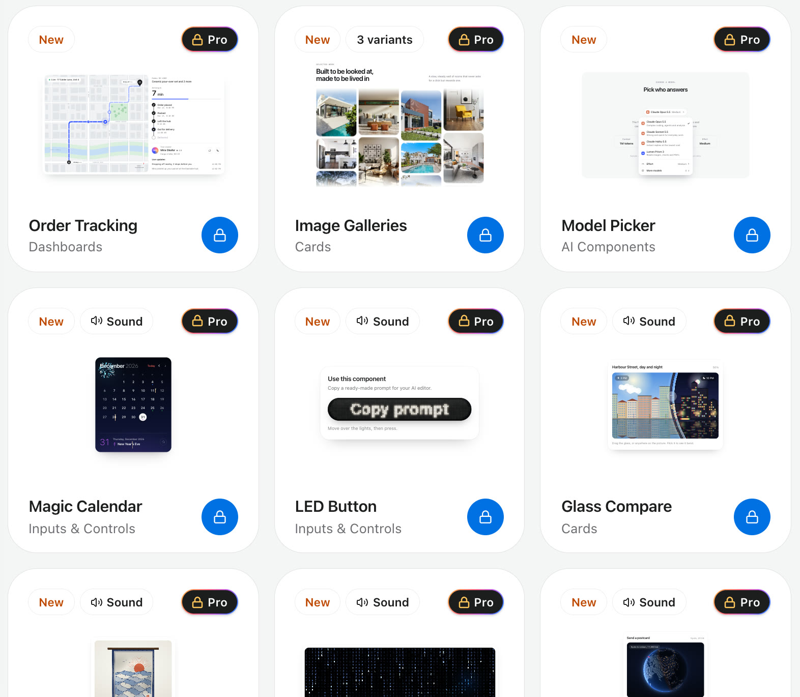
Nexus UI is our own library, so weigh this section accordingly. It sits in the same animated, copy-in group, built with React, Next.js, Tailwind CSS and Framer Motion and installed through the shadcn CLI:
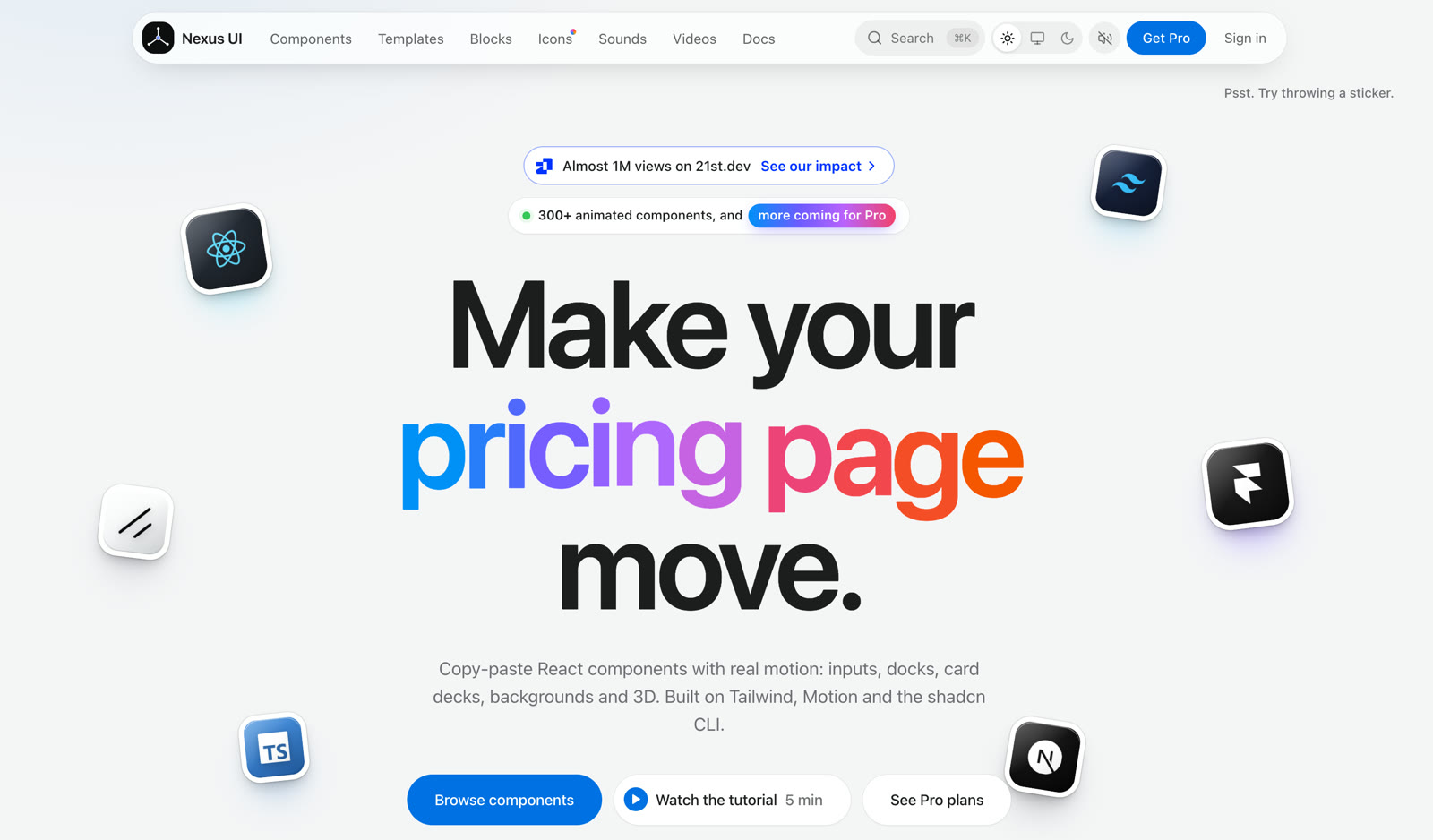
npx shadcn@latest add @nexus-labs/dynamic-island
Components that feel native
Where the libraries above lean toward dramatic effects, Nexus UI leans toward interaction that feels like a well-made native app: a Dynamic Island, springy toggles, slide-to-confirm controls and wheel pickers. Many components ship with optional sound, and every component page has a live preview you can replay before you install anything. The catalogue has 300 components.
Blocks for whole page sections
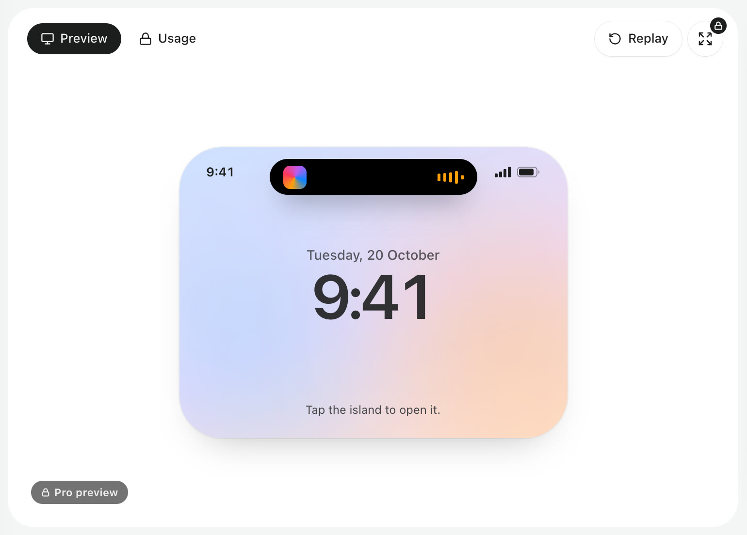
Blocks are complete sections you drop into a page: heroes, pricing, checkout, navigation, feature grids, testimonials and footers. There are 119 sections across 22 blocks, and several come in more than one layout.
Next.js templates
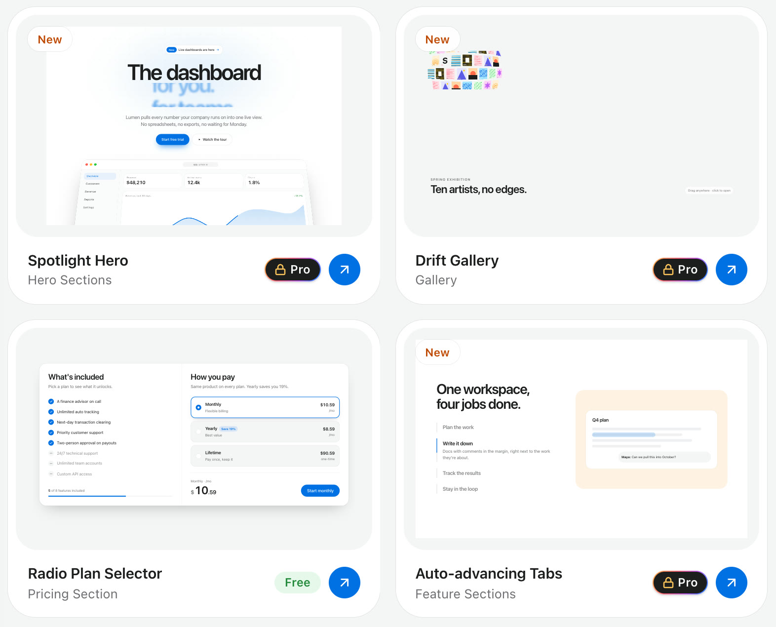
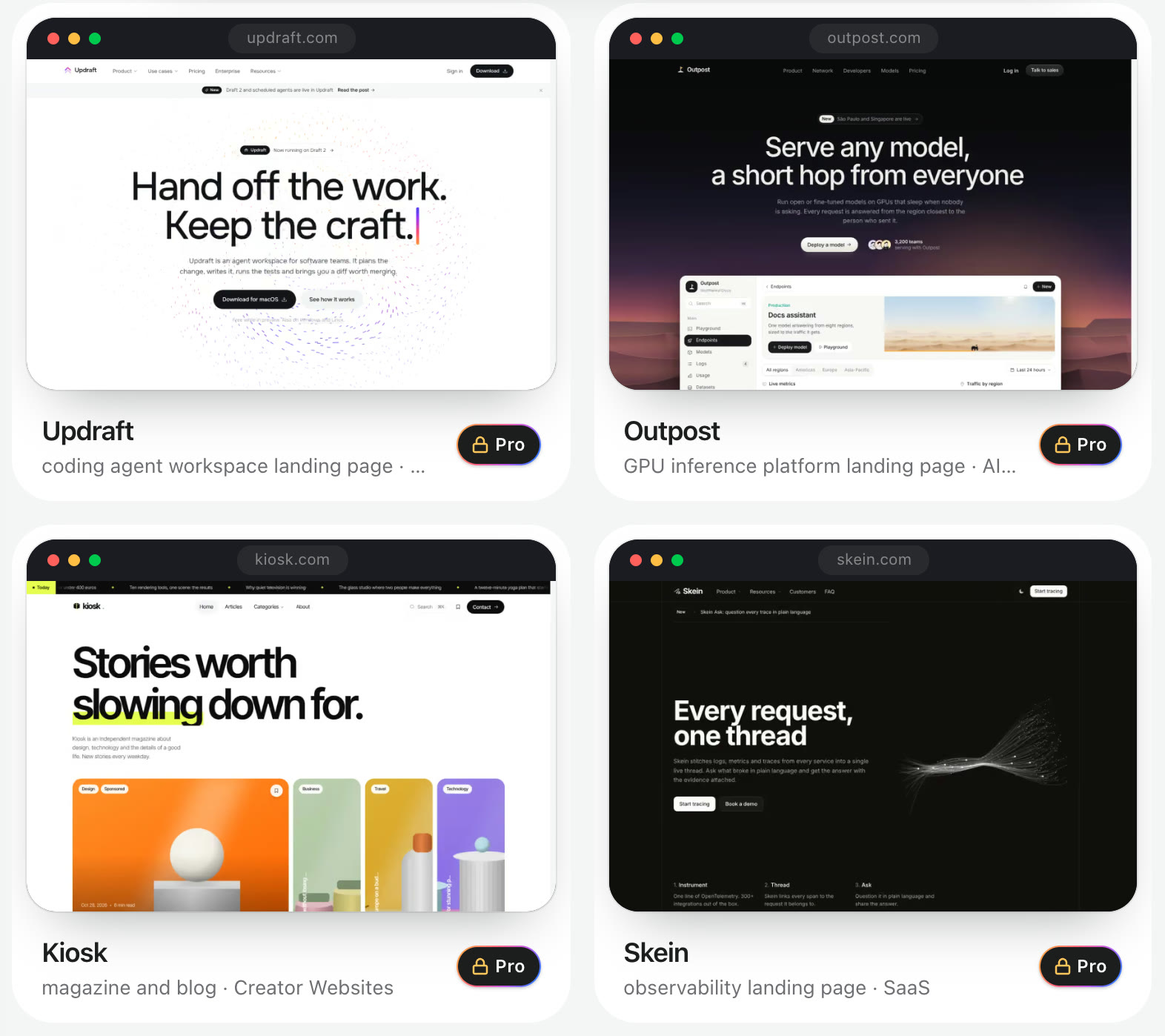
When you want a finished site rather than parts, there are 39 Next.js templates for AI tools, SaaS, agencies, fintech, portfolios and more. Anyone can open the live preview; the source comes with Pro.
Animated icons with sound
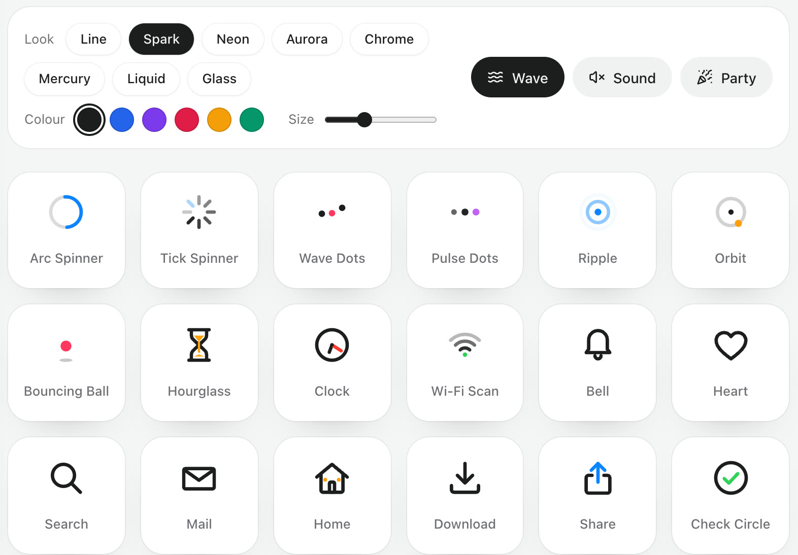
The icons set has 600 animated icons, from loaders to interface and commerce icons. You can restyle the whole set with one control (line, neon, glass, chrome and other looks), change colour and size, and switch on a matching sound for each one.
Price and limits
More than 70 components and 75 icons are free for personal, commercial and client work, along with the free blocks and two templates. Pro is $49.99 a year and All-Access is a one-time $79.99. An MCP server lets an AI coding agent search and install components for you by name. Details are on the pricing page.
The honest limits: it is not a general application kit, so pair it with shadcn/ui or a headless library for tables and forms. The free components are free to use but are not released under an open-source licence such as MIT, and most of the catalogue is paid.
How to choose a React component library
Five questions settle most decisions.
- How do you style? If you use Tailwind CSS, stay with libraries built on it (shadcn/ui, HeroUI, daisyUI and the animated group). Mixing Tailwind with a CSS-in-JS library works, but it adds friction every day.
- Do you want to own the code? Copy-in source gives total control and manual updates. A package gives easy updates and less control. Neither is wrong; pick the trade you prefer.
- How custom is the design? The further your brand is from a library's default look, the more a headless or copy-in approach pays off.
- What does the product do? Dashboards need tables, filters and forms. Marketing sites need heroes, pricing sections and motion. Few libraries are strong at both, which is why many teams use two.
- What does the licence allow? MIT and Apache 2.0 let you do almost anything. Paid libraries usually allow unlimited projects but forbid reselling the source. Read the terms before you build on them.
Whatever you choose, check accessibility yourself. Tab through a dialog and a menu with the keyboard before you commit, because that is the work that is hardest to add later.
Can you use more than one?
Yes, and it is common. A typical modern stack is shadcn/ui for the application interface plus an animated library for the marketing pages, both installed as source into the same project and sharing the same Tailwind theme. What to avoid is two styled packages with their own theme systems, such as MUI and Ant Design together, since you pay for both in bundle size and visual inconsistency.
Frequently asked questions
What is a React component library?
It is a collection of reusable interface pieces, such as buttons, modals, menus and form fields, written as React components. You install or copy them into your project instead of building each one from scratch.
Which React component library is the most popular?
MUI has long been the most widely installed styled library, and shadcn/ui has become the most common choice for new Tailwind CSS projects. Popularity is a useful sign of documentation and community help, but fit with your styling approach matters more.
Is shadcn/ui a component library?
Not in the traditional sense. It is a set of components you copy into your codebase with a CLI rather than a package you import. In practice people use it exactly as they would a library, with the difference that they own and edit the source.
What is the best React component library for Next.js?
Any of the libraries here work with Next.js. For the App Router, prefer ones without runtime CSS-in-JS, such as shadcn/ui, Mantine, HeroUI or the copy-in animated libraries, since they work cleanly with Server Components. Our guide to React components for Next.js goes further.
Are React component libraries free?
Most of the well-known ones are free and open source. Some sell extras on top: MUI charges for advanced data grid features, and animated libraries such as Aceternity UI, Magic UI and Nexus UI sell premium components, blocks or templates alongside a free set.
Where to go from here
If your shortlist includes an animated library, browse the free Nexus UI components and try a few in the live playgrounds, or read our comparison of the best animation libraries for React to choose the motion layer underneath. If you are still deciding between specific names, the alternatives pages put them side by side.