
React Stepper Component: Build It Step by Step
Build an accessible React stepper with Tailwind CSS and Framer Motion: animated steps, a multi-step form, a Next.js App Router version and a number stepper.
A stepper shows people where they are in a process: step 2 of 4 in a signup, the shipping stage of a checkout, the third screen of an onboarding tour. It is a small component, but it carries a lot. It has to show order, show status, move between steps, and stay usable with a keyboard and a screen reader.
This guide builds a React stepper from scratch in four stages: the markup and state, animation with Framer Motion, a multi-step form with validation, and the other kind of stepper, the plus and minus number control. The code is React with TypeScript and Tailwind CSS, and every component below was run and tested before it went on this page. If you would rather install a finished one, the ready-made React steppers are listed near the end.
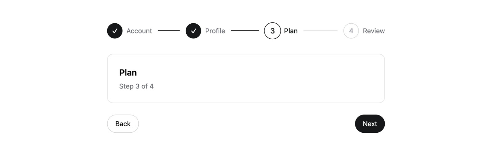
What a React stepper needs
Before writing any code, it helps to list the parts. Every progress stepper has the same four:
- A list of steps. Order matters, so the right element is an ordered list,
<ol>. - A status for each step. Complete, current or upcoming. Everything visual follows from this.
- A connector between steps that fills in as you move forward.
- Controls to move back and forward, and sometimes to jump to a finished step.
Two details make it accessible. Mark the active step with aria-current="step", which tells a screen reader which item in the list is the current one. And do not rely on colour alone for status: add a short piece of visually hidden text such as "Completed" so the state is announced, not just shown.
Stage 1: the markup and state
The whole component needs one number in state: the index of the current step. A step is complete if its index is lower, current if it is equal, and upcoming if it is higher.
"use client";

import { useState } from "react";
import { cn } from "@/lib/utils";

const steps = ["Account", "Profile", "Plan", "Review"];

export function Stepper() {
  const [current, setCurrent] = useState(0);
  const isLast = current === steps.length - 1;

  return (
    <div className="mx-auto max-w-xl">
      <ol className="flex items-center">
        {steps.map((label, i) => {
          const done = i < current;
          const active = i === current;
          return (
            <li
              key={label}
              aria-current={active ? "step" : undefined}
              className="flex flex-1 items-center last:flex-none"
            >
              <span
                className={cn(
                  "grid size-8 shrink-0 place-items-center rounded-full border text-sm font-medium",
                  done && "border-zinc-900 bg-zinc-900 text-white",
                  active && "border-zinc-900 text-zinc-900",
                  !done && !active && "border-zinc-300 text-zinc-400",
                )}
              >
                {done ? "✓" : i + 1}
              </span>
              <span className={cn("ml-2 text-sm", active ? "font-medium text-zinc-900" : "text-zinc-500")}>
                <span className="sr-only">
                  {done ? "Completed: " : active ? "Current: " : "Upcoming: "}
                </span>
                {label}
              </span>
              {i < steps.length - 1 && (
                <span
                  aria-hidden
                  className={cn("mx-3 h-0.5 flex-1 rounded-full", done ? "bg-zinc-900" : "bg-zinc-200")}
                />
              )}
            </li>
          );
        })}
      </ol>

      <div className="mt-8 rounded-xl border border-zinc-200 p-6">
        <h3 className="text-lg font-semibold">{steps[current]}</h3>
        <p className="mt-1 text-sm text-zinc-500">
          Step {current + 1} of {steps.length}
        </p>
      </div>

      <div className="mt-6 flex justify-between">
        <button
          type="button"
          onClick={() => setCurrent((c) => Math.max(c - 1, 0))}
          disabled={current === 0}
          className="rounded-full border border-zinc-300 px-4 py-2 text-sm disabled:opacity-40"
        >
          Back
        </button>
        <button
          type="button"
          onClick={() => setCurrent((c) => Math.min(c + 1, steps.length - 1))}
          disabled={isLast}
          className="rounded-full bg-zinc-900 px-4 py-2 text-sm text-white disabled:opacity-40"
        >
          Next
        </button>
      </div>
    </div>
  );
}
A few things to notice:
flex-1on each list item lets the connector stretch to fill the space, andlast:flex-nonestops the final step from leaving an empty gap after it.- The connector is marked
aria-hiddenbecause it is decoration. The status text insidesr-onlycarries the meaning instead. Math.maxandMath.minkeep the index inside the list, and the buttons are disabled at each end so there is nothing to press when you cannot move.
The cn helper merges class names and is the same one shadcn/ui projects use. If you have not set it up, our guide to the cn utility covers it in a few lines.
Stage 2: animate it with Framer Motion
The static version jumps from one state to the next. Three small animations make it feel finished: the connector fills from left to right, the step circle changes colour with a spring, and the content slides in from the direction you are moving.
npm install framer-motion
"use client";

import { useEffect, useRef, useState } from "react";
import { AnimatePresence, MotionConfig, motion } from "framer-motion";
import { cn } from "@/lib/utils";

const steps = ["Account", "Profile", "Plan", "Review"];

const panel = {
  enter: (direction: number) => ({ opacity: 0, x: direction * 24 }),
  center: { opacity: 1, x: 0 },
  exit: (direction: number) => ({ opacity: 0, x: direction * -24 }),
};

// Mounts once per step, so the effect runs each time a new step slides in.
function StepHeading({ children, focus }: { children: React.ReactNode; focus: boolean }) {
  const ref = useRef<HTMLHeadingElement>(null);

  useEffect(() => {
    if (focus) ref.current?.focus();
  }, [focus]);

  return (
    <h3 ref={ref} tabIndex={-1} className="text-lg font-semibold outline-none">
      {children}
    </h3>
  );
}

export function AnimatedStepper() {
  const [[current, direction], setStep] = useState([0, 1]);
  const moved = useRef(false);

  const go = (next: number) => {
    if (next < 0 || next > steps.length - 1) return;
    moved.current = true;
    setStep([next, next > current ? 1 : -1]);
  };

  return (
    <MotionConfig reducedMotion="user">
      <div className="mx-auto max-w-xl">
        <ol className="flex items-center">
          {steps.map((label, i) => {
            const done = i < current;
            const active = i === current;
            return (
              <li
                key={label}
                aria-current={active ? "step" : undefined}
                className="flex flex-1 items-center last:flex-none"
              >
                <button
                  type="button"
                  onClick={() => go(i)}
                  disabled={!done}
                  className="flex items-center gap-2 rounded-full disabled:cursor-default"
                >
                  <motion.span
                    initial={false}
                    animate={{
                      backgroundColor: done ? "#18181b" : "#ffffff",
                      borderColor: done || active ? "#18181b" : "#d4d4d8",
                      color: done ? "#ffffff" : active ? "#18181b" : "#a1a1aa",
                      scale: active ? 1.1 : 1,
                    }}
                    transition={{ type: "spring", stiffness: 400, damping: 28 }}
                    className="grid size-8 shrink-0 place-items-center rounded-full border text-sm font-medium"
                  >
                    {done ? "✓" : i + 1}
                  </motion.span>
                  <span className={cn("text-sm", active ? "font-medium text-zinc-900" : "text-zinc-500")}>
                    <span className="sr-only">
                      {done ? "Completed: " : active ? "Current: " : "Upcoming: "}
                    </span>
                    {label}
                  </span>
                </button>
                {i < steps.length - 1 && (
                  <span
                    aria-hidden
                    className="relative mx-3 h-0.5 flex-1 overflow-hidden rounded-full bg-zinc-200"
                  >
                    <motion.span
                      className="absolute inset-0 origin-left bg-zinc-900"
                      initial={false}
                      animate={{ scaleX: done ? 1 : 0 }}
                      transition={{ type: "spring", stiffness: 300, damping: 30 }}
                    />
                  </span>
                )}
              </li>
            );
          })}
        </ol>

        <div className="mt-8 overflow-hidden rounded-xl border border-zinc-200 p-6">
          <AnimatePresence mode="wait" initial={false} custom={direction}>
            <motion.div
              key={current}
              custom={direction}
              variants={panel}
              initial="enter"
              animate="center"
              exit="exit"
              transition={{ duration: 0.2 }}
            >
              <StepHeading focus={moved.current}>{steps[current]}</StepHeading>
              <p className="mt-1 text-sm text-zinc-500">
                Step {current + 1} of {steps.length}
              </p>
            </motion.div>
          </AnimatePresence>
        </div>

        <div className="mt-6 flex justify-between">
          <button
            type="button"
            onClick={() => go(current - 1)}
            disabled={current === 0}
            className="rounded-full border border-zinc-300 px-4 py-2 text-sm disabled:opacity-40"
          >
            Back
          </button>
          <button
            type="button"
            onClick={() => go(current + 1)}
            disabled={current === steps.length - 1}
            className="rounded-full bg-zinc-900 px-4 py-2 text-sm text-white disabled:opacity-40"
          >
            Next
          </button>
        </div>
      </div>
    </MotionConfig>
  );
}
What changed, and why:
The connector is two layers. A grey track with a dark bar on top. The bar animates scaleX from 0 to 1 with origin-left, so it grows from the left edge. Animating a transform is much cheaper than animating width, because the browser does not have to recalculate layout on every frame.
State holds the direction too. useState([0, 1]) stores the step and whether the last move was forward (1) or back (-1). The panel's enter and exit variants read that value through the custom prop, so going back slides the content the other way. Passing custom to AnimatePresence as well matters: it lets the outgoing panel use the new direction rather than the one it was rendered with.
Completed steps are buttons. People often want to go back and fix something. Each step is a <button> that is only enabled once the step is complete, so you can jump back but never skip ahead.
Focus moves with the content. When the step changes, a sighted user sees the new panel. A screen reader user needs to be told. StepHeading focuses itself when it mounts, and because the panel has key={current}, it mounts fresh for every step. The moved ref stops it from grabbing focus on first page load.
Motion respects the user's setting. MotionConfig reducedMotion="user" turns off the slide and scale for anyone who has asked their system to reduce motion, and keeps the colour changes. There are more patterns like these in our Framer Motion examples.
Stage 3: a multi-step form with validation
The most common use for a stepper is a form split across several screens. The rule is simple: keep all the form data in one object, give every step a function that says whether it is valid, and only move forward when it returns true.
"use client";

import { useState } from "react";

type FormData = { email: string; name: string; plan: "" | "free" | "pro" };

const steps: { label: string; error: string; isValid: (data: FormData) => boolean }[] = [
  {
    label: "Account",
    error: "Enter a valid email address.",
    isValid: (data) => /^\S+@\S+\.\S+$/.test(data.email),
  },
  {
    label: "Profile",
    error: "Enter your name.",
    isValid: (data) => data.name.trim().length > 1,
  },
  {
    label: "Plan",
    error: "Choose a plan.",
    isValid: (data) => data.plan !== "",
  },
];

export function SignupStepper() {
  const [current, setCurrent] = useState(0);
  const [data, setData] = useState<FormData>({ email: "", name: "", plan: "" });
  const [error, setError] = useState("");
  const [submitted, setSubmitted] = useState(false);
  const isLast = current === steps.length - 1;

  const next = (event: React.FormEvent) => {
    event.preventDefault();
    const step = steps[current];
    if (!step.isValid(data)) {
      setError(step.error);
      return;
    }
    setError("");
    if (isLast) setSubmitted(true);
    else setCurrent(current + 1);
  };

  const back = () => {
    setError("");
    setCurrent(current - 1);
  };

  if (submitted) {
    return <p role="status">Thanks, {data.name}. You are on the {data.plan} plan.</p>;
  }

  return (
    <form onSubmit={next} noValidate className="mx-auto max-w-sm">
      <p className="text-sm text-zinc-500">
        Step {current + 1} of {steps.length}: {steps[current].label}
      </p>

      <div className="mt-4">
        {current === 0 && (
          <label className="block text-sm">
            Email
            <input
              type="email"
              value={data.email}
              onChange={(e) => setData({ ...data, email: e.target.value })}
              aria-invalid={error !== ""}
              aria-describedby={error ? "step-error" : undefined}
              className="mt-1 w-full rounded-lg border border-zinc-300 px-3 py-2"
            />
          </label>
        )}
        {current === 1 && (
          <label className="block text-sm">
            Name
            <input
              value={data.name}
              onChange={(e) => setData({ ...data, name: e.target.value })}
              aria-invalid={error !== ""}
              aria-describedby={error ? "step-error" : undefined}
              className="mt-1 w-full rounded-lg border border-zinc-300 px-3 py-2"
            />
          </label>
        )}
        {current === 2 && (
          <fieldset aria-describedby={error ? "step-error" : undefined}>
            <legend className="text-sm">Plan</legend>
            {(["free", "pro"] as const).map((plan) => (
              <label key={plan} className="mt-2 flex items-center gap-2 text-sm capitalize">
                <input
                  type="radio"
                  name="plan"
                  checked={data.plan === plan}
                  onChange={() => setData({ ...data, plan })}
                />
                {plan}
              </label>
            ))}
          </fieldset>
        )}
      </div>

      {error && (
        <p id="step-error" role="alert" className="mt-2 text-sm text-red-600">
          {error}
        </p>
      )}

      <div className="mt-6 flex justify-between">
        <button
          type="button"
          onClick={back}
          disabled={current === 0}
          className="rounded-full border border-zinc-300 px-4 py-2 text-sm disabled:opacity-40"
        >
          Back
        </button>
        <button type="submit" className="rounded-full bg-zinc-900 px-4 py-2 text-sm text-white">
          {isLast ? "Create account" : "Next"}
        </button>
      </div>
    </form>
  );
}
The parts worth copying:
- One
onSubmithandles everything. Wrapping the steps in a<form>means the Enter key works on every step, and the last step submits the same way the others advance. - Validation lives next to the step. Each entry in
stepsowns itsisValidcheck and its error message, so adding a step is one new object and one new field. - Errors are announced. The message has
role="alert", so it is read out when it appears, and the input points to it witharia-describedby. - Data survives going back. Because the values live in the parent, not in the fields, nothing is lost when a step unmounts.
For a real product you would swap the hand-written checks for a schema library and send data to your server on the last step. The shape stays the same. To show progress above the form, drop the step list from stage 1 or 2 on top and pass it the same current value.
A vertical stepper
Horizontal steppers run out of room on phones and with long labels. A vertical layout fixes both, and gives each step space for a line of description. The logic does not change; only the layout does. Each list item becomes a row with two columns: the circle and connector on the left, the text on the right.
import { cn } from "@/lib/utils";

const steps = [
  { label: "Account", hint: "Email and password" },
  { label: "Profile", hint: "Name and photo" },
  { label: "Plan", hint: "Free or Pro" },
];

export function VerticalSteps({ current }: { current: number }) {
  return (
    <ol>
      {steps.map((step, i) => {
        const done = i < current;
        const active = i === current;
        return (
          <li key={step.label} aria-current={active ? "step" : undefined} className="flex gap-3">
            <div className="flex flex-col items-center">
              <span
                className={cn(
                  "grid size-8 shrink-0 place-items-center rounded-full border text-sm font-medium",
                  done && "border-zinc-900 bg-zinc-900 text-white",
                  active && "border-zinc-900 text-zinc-900",
                  !done && !active && "border-zinc-300 text-zinc-400",
                )}
              >
                {done ? "✓" : i + 1}
              </span>
              {i < steps.length - 1 && (
                <span
                  aria-hidden
                  className={cn("my-1 w-0.5 flex-1 rounded-full", done ? "bg-zinc-900" : "bg-zinc-200")}
                />
              )}
            </div>
            <div className="pb-8">
              <p className={cn("text-sm", active ? "font-medium text-zinc-900" : "text-zinc-500")}>
                {step.label}
              </p>
              <p className="text-sm text-zinc-500">{step.hint}</p>
            </div>
          </li>
        );
      })}
    </ol>
  );
}
The connector uses flex-1 in a column, so it stretches to match however tall the text beside it is. A common approach is to render the horizontal version on wide screens and this one on narrow screens. If your steps are dated milestones rather than a process the user moves through, a timeline is the better pattern, and our React timeline component guide builds one.
The other stepper: a number input
"Stepper" also means the plus and minus control for a quantity, such as guests, items in a cart or seats on a plan. It is a different component with the same name, and it comes up often enough to cover here.
"use client";

import { useState } from "react";

export function NumberStepper({ min = 1, max = 10 }: { min?: number; max?: number }) {
  const [value, setValue] = useState(min);

  return (
    <div role="group" aria-label="Quantity" className="inline-flex items-center gap-3">
      <button
        type="button"
        aria-label="Decrease quantity"
        onClick={() => setValue((v) => Math.max(v - 1, min))}
        disabled={value <= min}
        className="grid size-9 place-items-center rounded-full border border-zinc-300 disabled:opacity-40"
      >
        −
      </button>
      <output aria-live="polite" className="w-8 text-center text-lg font-medium tabular-nums">
        {value}
      </output>
      <button
        type="button"
        aria-label="Increase quantity"
        onClick={() => setValue((v) => Math.min(v + 1, max))}
        disabled={value >= max}
        className="grid size-9 place-items-center rounded-full border border-zinc-300 disabled:opacity-40"
      >
        +
      </button>
    </div>
  );
}
Each button has an aria-label, because a bare plus or minus sign is not a useful name. The value sits in an <output> with aria-live="polite", so a screen reader reads the new number after each press. Clamping with min and max and disabling the button at each limit means the control can never show an impossible value. tabular-nums keeps the digits the same width so the buttons do not shift as the number changes.
A stepper in the Next.js App Router
In a Next.js app, the best place to keep the current step is the URL, not component state. The Back button then works, a refresh keeps your place, and you can link someone straight to step 3. The hook below reads a step search parameter, clamps it to a valid range, and pushes a new URL when the step changes.
"use client";

import { usePathname, useRouter, useSearchParams } from "next/navigation";

const STEPS = ["Account", "Profile", "Plan", "Review"] as const;

export function useStep() {
  const router = useRouter();
  const pathname = usePathname();
  const params = useSearchParams();

  const raw = Number(params.get("step") ?? 1);
  const step = Number.isInteger(raw) ? Math.min(Math.max(raw, 1), STEPS.length) : 1;

  function go(target: number) {
    const query = new URLSearchParams(params.toString());
    query.set("step", String(Math.min(Math.max(target, 1), STEPS.length)));
    router.push(`${pathname}?${query.toString()}`, { scroll: false });
  }

  return {
    step,
    total: STEPS.length,
    label: STEPS[step - 1],
    next: () => go(step + 1),
    back: () => go(step - 1),
  };
}
Use it in a client component, and wrap that component in Suspense. Next.js asks for this whenever a prerendered page reads search parameters on the client, so that the rest of the page can still be sent as static HTML.
import { Suspense } from "react";
import { useStep } from "./use-step";

function StepperBody() {
  const { step, total, label, next, back } = useStep();
  return (
    <div>
      <p>
        Step {step} of {total}: {label}
      </p>
      <button type="button" onClick={back} disabled={step === 1}>
        Back
      </button>
      <button type="button" onClick={next} disabled={step === total}>
        Next
      </button>
    </div>
  );
}

export default function Page() {
  return (
    <Suspense fallback={null}>
      <StepperBody />
    </Suspense>
  );
}
Put "use client" at the top of the file that holds StepperBody, since it uses a hook. Swap the plain text for the stepper markup from Stage 1 and the animation from Stage 2; nothing else changes. Keep form values somewhere that survives navigation between steps, such as a parent layout, a context provider or a server action that saves a draft, because each router.push re-renders the route.
Ready-made React steppers
If you need a stepper on a page today, these are finished options.
From Nexus UI. These are our own components, built with React, Tailwind CSS and Framer Motion and installed as source with the shadcn CLI.
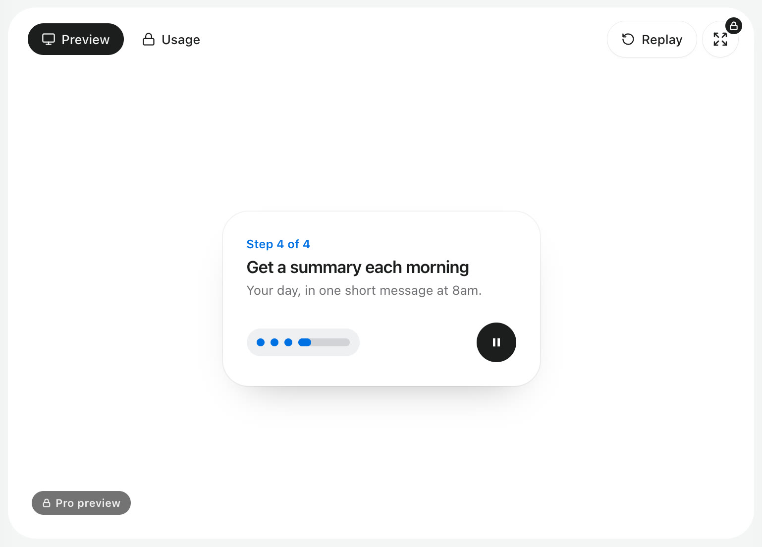
- Step Player: a stepper for onboarding tours. The current step stretches into a bar that fills as it plays, then eases to the next, and you can play, pause or jump to any step. It is a Pro component.
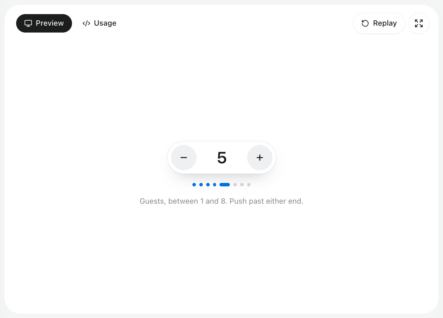
- Elastic Stepper: a number stepper. The value rolls up or down, a dot track stretches to follow it, and it rubber-bands when you push past either limit. It is free.
npx shadcn@latest add @nexus-labs/elastic-stepper
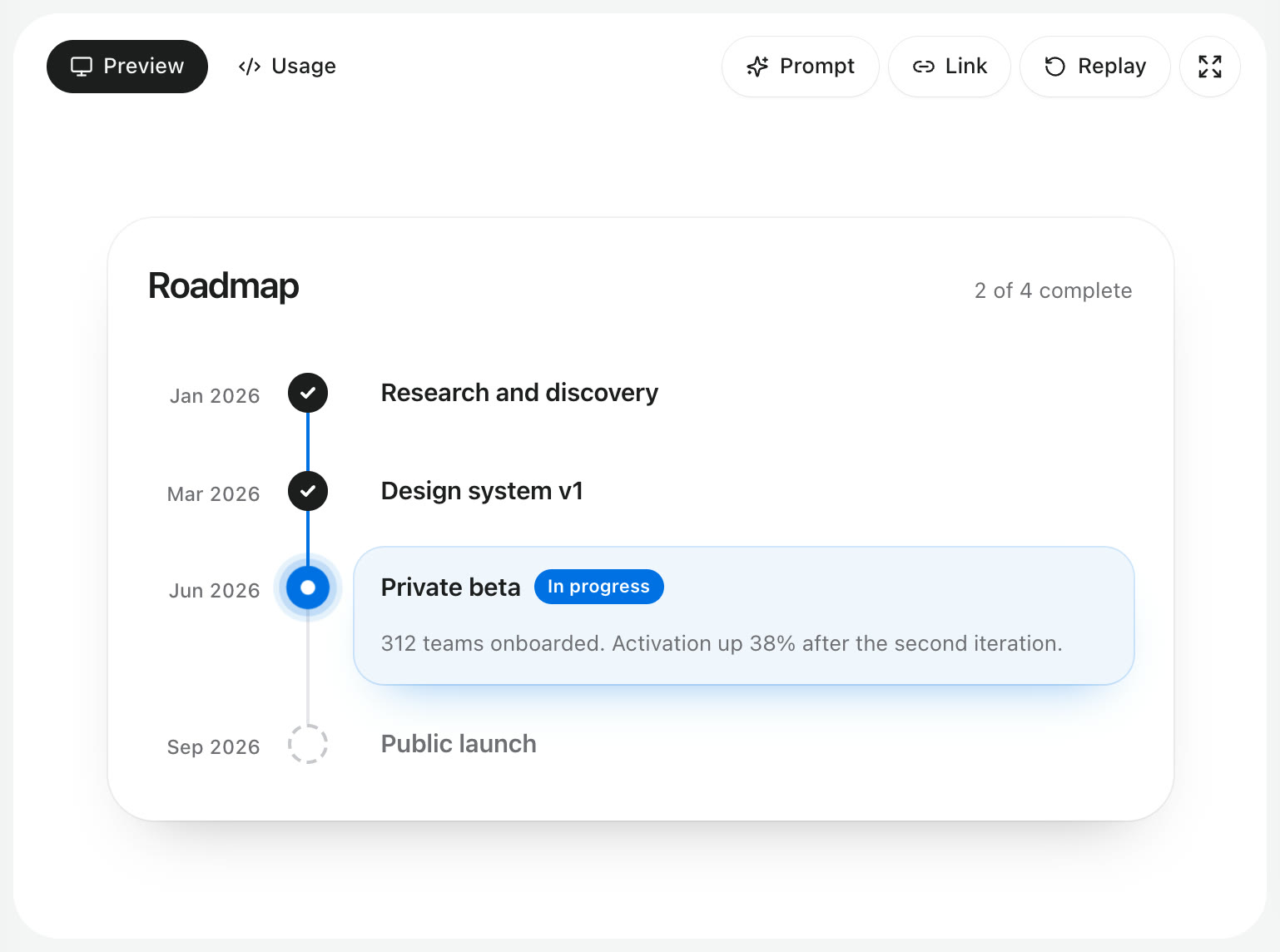
- Milestone Timeline: for steps that are milestones on a roadmap rather than screens in a flow, with done, current and upcoming states. It is free.
From general libraries. If your app already uses one of the big component libraries, use its stepper rather than adding another dependency. MUI has a Stepper with horizontal, vertical and non-linear modes. Mantine has a Stepper with built-in step content. Ant Design and Chakra UI both call theirs Steps. They are quick to drop in; the trade-off is that the markup and motion are theirs to decide. Our comparison of React component libraries covers how those libraries differ.
Frequently asked questions
What is a stepper in React?
It is a component that shows progress through a sequence of steps and lets the user move between them. It is usually an ordered list with a status for each step, plus Back and Next buttons. The same word is also used for a plus and minus number control.
How do I make a multi-step form in React?
Keep the current step index and all the form values in one parent component. Render only the fields for the current step, validate that step when the user presses Next, and move forward only if it passes. Stage 3 above is a complete example.
Should a stepper let users skip steps?
Usually not. In a linear flow such as checkout, let people go back to any completed step but not jump ahead, because later steps often depend on earlier answers. A non-linear stepper only suits cases where the steps are truly independent, such as sections of a settings page.
How do I make a stepper accessible?
Use an ordered list, mark the active item with aria-current="step", give each status a text equivalent instead of colour alone, make sure every control is a real button, and move focus to the new step's heading when the step changes.
Do I need a library for a React stepper?
No. The basic version in this guide is about sixty lines with no dependencies beyond a class name helper. A library is worth it when your app already uses one, or when you want polished motion without writing it.
How do I build a stepper in Next.js?
Store the current step in a search parameter such as ?step=2 and read it with useSearchParams. Clamp the value to the valid range, push a new URL on Next and Back, and wrap the client component in Suspense. The section above has the full hook.
Where to go from here
You now have a progress stepper, an animated version, a validated multi-step form, a vertical layout, a Next.js App Router version and a number stepper. To see finished, animated versions before you build your own, open the Step Player and Elastic Stepper previews, or browse the rest of the components.