
Profile Card, animated React component
A profile card built around its pictures. The cover photo drifts against your pointer, and the 3D avatar rises out of its frame when you point at it. Follow for a burst of confetti and a follower count that rolls up a digit.
- Pro
- Cards
- Hover
- 3D
A pop of confetti and a soft tick as the count rolls. Sound is off on this site until you switch it on.
Play with it
Move the controls and watch it change. Copy code gives you a snippet with only the props you changed.

Identity and motion for software companies. Eight years in, mostly fintech and climate tools.
Props
| Prop | Type | Default | What it does |
|---|---|---|---|
| name | string | "Lena Hartmann" | The person's name. |
| role | string | "Brand and motion designer" | What they do. |
| location | string | "Lisbon" | Where they are. |
| bio | string | "Identity and motion for software companies. Eight years in, mostl…" | A short paragraph about them. |
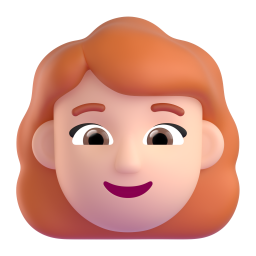
| avatar | string | sample data | A picture of the person, ideally a cut-out on a transparent background so it can rise out of the frame. |
| avatarTint | string | "#ffd9c7" | The colour of the disc behind the avatar. |
| cover | string | sample data | The cover photo. |
| status | string | "Booking projects from March" | A short line under the name, such as when they take new work. Empty hides it. |
| skills | string[] | sample data | The skills listed as chips. |
| followers | number | 12480 | The follower count. |
| projects | number | 86 | The project count. |
| rating | number | 4.9 | The rating out of 5. |
| verified | boolean | true | Show the verified badge. |
| onFollow | (following: boolean) => void | — | Called with the new following state. |
| onMessage | () => void | — | Called when Message is pressed. |
| enableSound | boolean | true | Soft synthesised sounds as you use it. They also follow the site-wide sound switch. |
| volume | number | 0.6 | Sound level, 0 to 1. |
| autoplay | boolean | false | Plays a short demo by itself until the visitor touches it. Never runs under reduced motion. |
| className | string | "" | Extra classes for the outer element. |
Add it to your project
- 1
Set up your project once
You need a Next.js project with Tailwind CSS and the
@/import alias. In its root folder, run this once. It createscomponents.jsonand thecn()helper insrc/lib/utils.ts:npx shadcn@latest init -d
Starting from nothing? The Quick Start walks through the whole thing.
- 2
Connect the registry with your API key
Profile Card is a Pro item, so the CLI has to send your API key. Do this once per project:
- Create a key at nexus-ui.com/dashboard/api-key. Copy it straight away: it starts with
nxs_and is shown only once. - In your project root, next to
package.json, create a file named.env.localwith this line, using your own key:NEXUS_API_KEY=nxs_your_key_here
- Open
components.jsonand add this entry inside the outermost braces, next to"aliases". Leave{name}and${NEXUS_API_KEY}exactly as written; the CLI fills them in:"registries": { "@nexus-labs": { "url": "https://www.nexus-ui.com/api/registry/{name}", "headers": { "Authorization": "Bearer ${NEXUS_API_KEY}" } } }
- Create a key at nexus-ui.com/dashboard/api-key. Copy it straight away: it starts with
How Profile Card works
A creator's profile card, photo first. The cover is a full photo that drifts against the pointer like a window you look through, while the avatar (a 3D cut-out) moves the other way and rises out of its round frame when you point at it, so the card has real depth. Follow and the button turns into Following with a burst of confetti while
The source, the install command and the build prompt come with Pro.
Profile Card questions
Does it make sound, and how do I turn it off?
A pop of confetti and a soft tick as the count rolls. Sounds are synthesised with the Web Audio API, so there are no audio files, and they only play after a click or key press. Pass `enableSound={false}` to silence this component, or call `setSoundsEnabled(false)` from `@/lib/ui-sounds` to switch every sound off at once. The CLI installs `@/lib/ui-sounds` with the component.